How to design a pop-up shop

Posted: Fri 21st Mar 2025
Last updated: Fri 21st Mar 2025
7 min read
Are you ready to get out there, engage with your customers and test your ideas in person?
One great way to do that is through a physical pop-up shop, so here are some tips on where to begin.
Create a clear strategy
It would be good to have a clear idea of why you're starting the pop-up in the first place. Based on your goals, you can develop the experience and format that works best for you.
Is it a short promotional stunt where you want to achieve the 'wow' effect? Or is it about testing a location over the long term?
Start with your brand and ideal customer
The design behind your pop-up shop should be an extension of your brand's story. The message you want to send to your clients has to be loud and memorable, especially if you're using the space only for a short period.
As a business owner, you always need to have a picture of your ideal client in mind. Who is that ideal customer to whom you're selling your product? What do they like and what will grab their attention? What do they enjoy doing and what is their ideal shopping experience?
Get creative and deliver an unforgettable experience!
If you understand your customer well enough and make an event of your pop-up, people won't want to miss it. What can make your brand unique are memorable experiences, Instagrammable places and dynamic content.
Create magic around your business, and think of demonstrations, performances and one-time offers that will appeal to people's curiosity. When they think of the product, make them remember their experience with you!
Fun things that you could do to attract customers include:
window displays
on-site activities (for example, presentations, classes and speaking engagements)
selfie spots that encourage social media interaction
using virtual reality to showcase new technologies
Spring season is all about bright colours, the smell of flowers, the taste of new fruits, and new bright beginnings. Use this emotional connection and call on those feelings, so people are more likely to remember your products.
Customer behaviour – a guided tour through your shop
As we go to the physical materialisation of your brand as a pop-up, we need to create a narrative for customers coming into your shop.
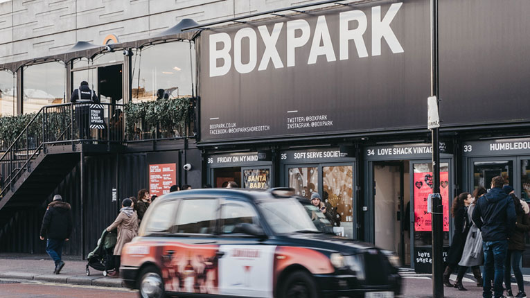
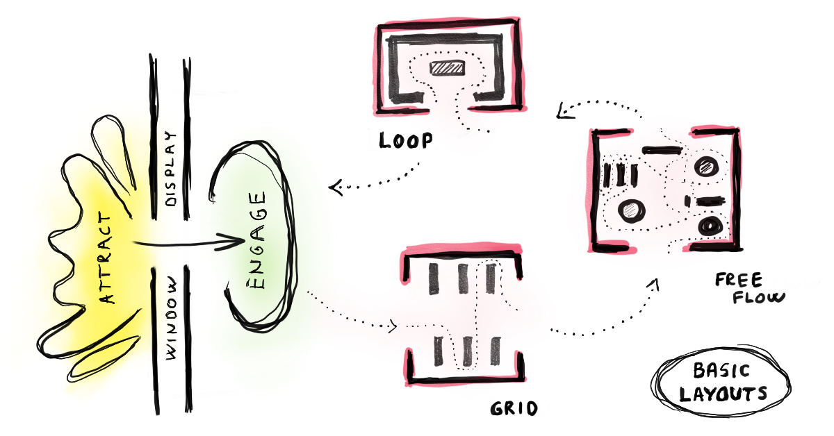
A window display is how you make a good first impression – a great way to attract customers and start communication.
When they enter the shop, customers need a transition space to adjust to the new environment, so within the first couple of metres (depending on the shop size) there is usually a 'decompression zone'. If you put content in this zone, people can easily overlook it.
Some retail statistics suggest that 90% of people turn right when they walk into a store. Other research says there is a 50–50 chance people will turn left or right. So, the best thing you can do for your business is to track the behaviour of your customers and create your own statistics in this regard.
Observing this behaviour is really important to properly designing a clear path and leading customers down it. We explain some of the most common shop layouts in the next section.
If you have a larger space, create speed bumps to make sure that people entering the store won't just hurry through without noticing your products.

Basic store layouts
These are some basic store layouts that retailers use most frequently.
Herringbone
This layout consists of aisles alongside the walls. It's good for displaying a lot of products in a small space, but it can feel cramped for customers.
Loop
In this case, the circular path is created and ends where the customer began. If you have a bigger space, this type may waste customers' time if they came for a specific product.
Free flow
This layout allows customers to wander without a specific path. However, you need to know your customers' behaviour because there are certain rules you need to follow so as to not make it confusing for people.
Displaying your products
If we're talking about visual merchandising, there is a saying 'Eye level is a buy level'. That said, bear in mind that if you're offering products that children would like, you should display them at their eye level, which is 90cm to 120cm off the ground.
There are many interesting ways to captivate your customers' attention, and what works best will depend on the product. If you're displaying a variety of products, you should classify them into different categories and put in the right place according to your customers' needs. Think about:
what your premium products are
what your most popular products are
what you want to promote at the moment
what could be an impulse buy
Draw attention to the products using signage, lighting or colour. Consider putting together items you can use with each other, arranging them by theme (for example, seasonal, holiday gifts and so on).
Final thoughts
With these points, we've just touched the tip of an iceberg, but the most important thing is to enjoy the process.
It's OK to exaggerate and be playful – this is just a temporary design and you're allowed to test and make mistakes. These solutions don't need to be pricey, so just release your creativity and have fun!
People also read
Get business support right to your inbox
Subscribe to our newsletter to receive business tips, learn about new funding programmes, join upcoming events, take e-learning courses, and more.
Start your business journey today
Take the first step to successfully starting and growing your business.
Join for free